Starbucks TypographyA Dream Realized
Starbucks has been the throughline of my career. For years, I worked within its digital systems, shaping marketing and product experiences while navigating typography that never quite felt like ours. I carried a quiet ambition to help create something more human. Something refined. Something with a bit of quirk and warmth. A typographic voice that could live everywhere the brand lived.
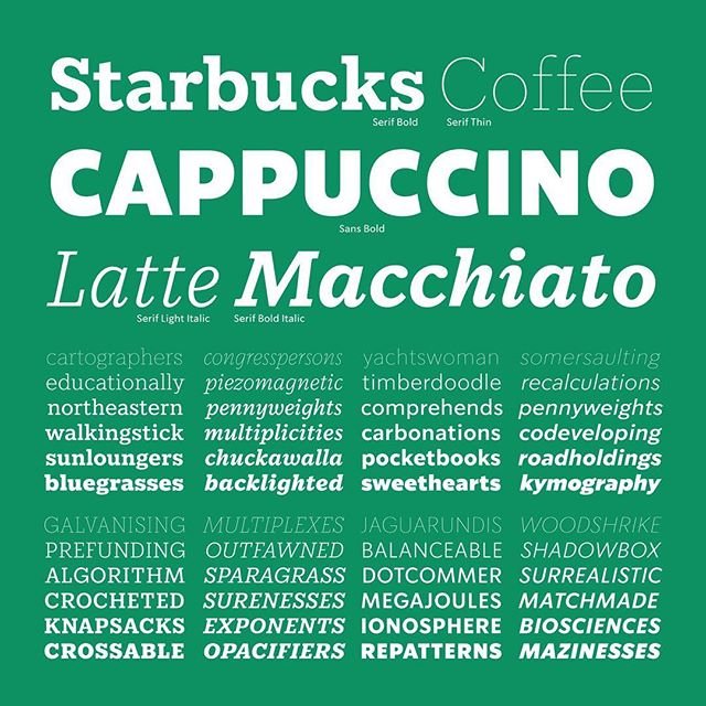
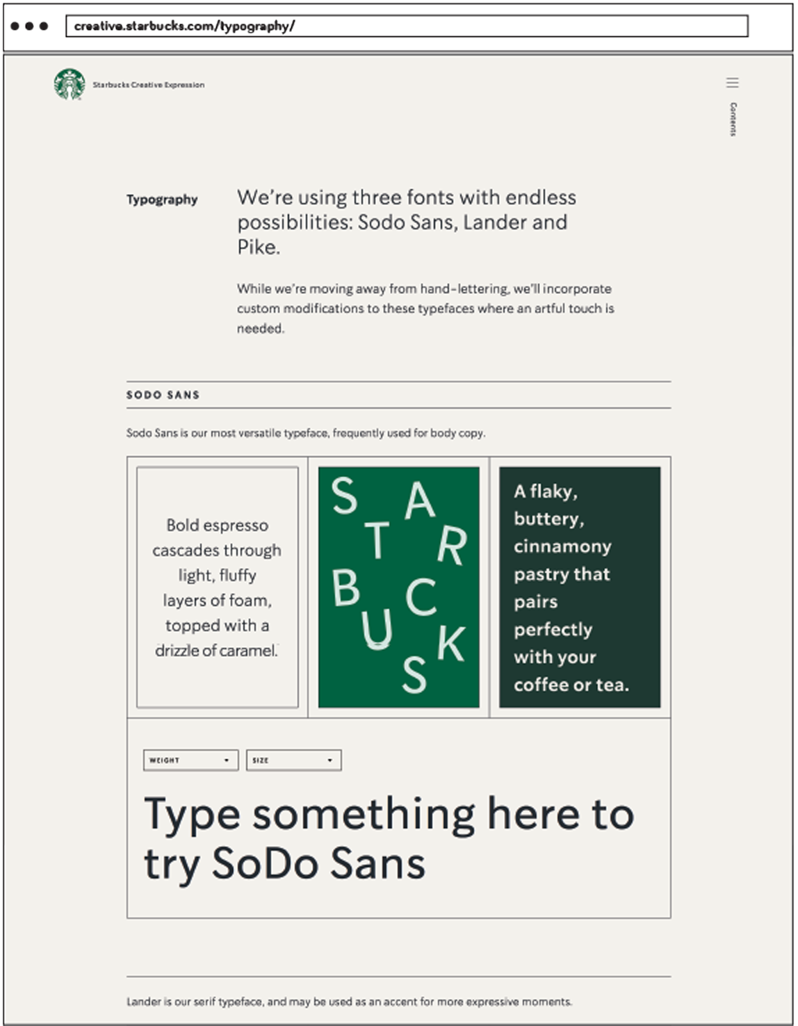
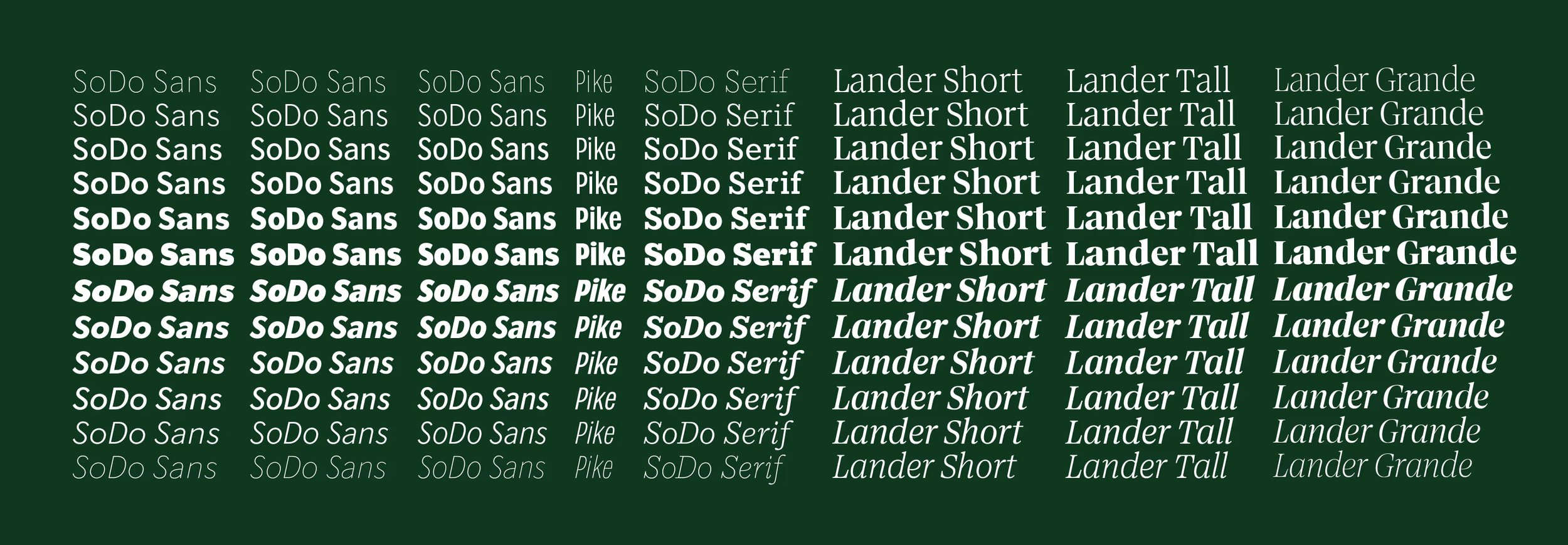
That dream became real through a year of deep collaboration with type designer Riley Cran. Together, we envisioned a new typographic foundation that would carry Starbucks into a new era. The result was SoDo, a custom sans serif family designed to speak fluently across all Latin languages while embodying the clarity, craft, and character of the brand itself.
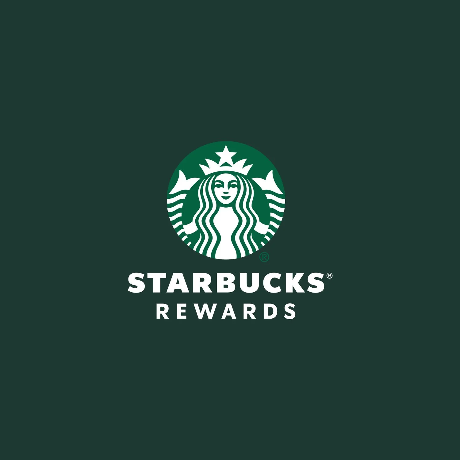
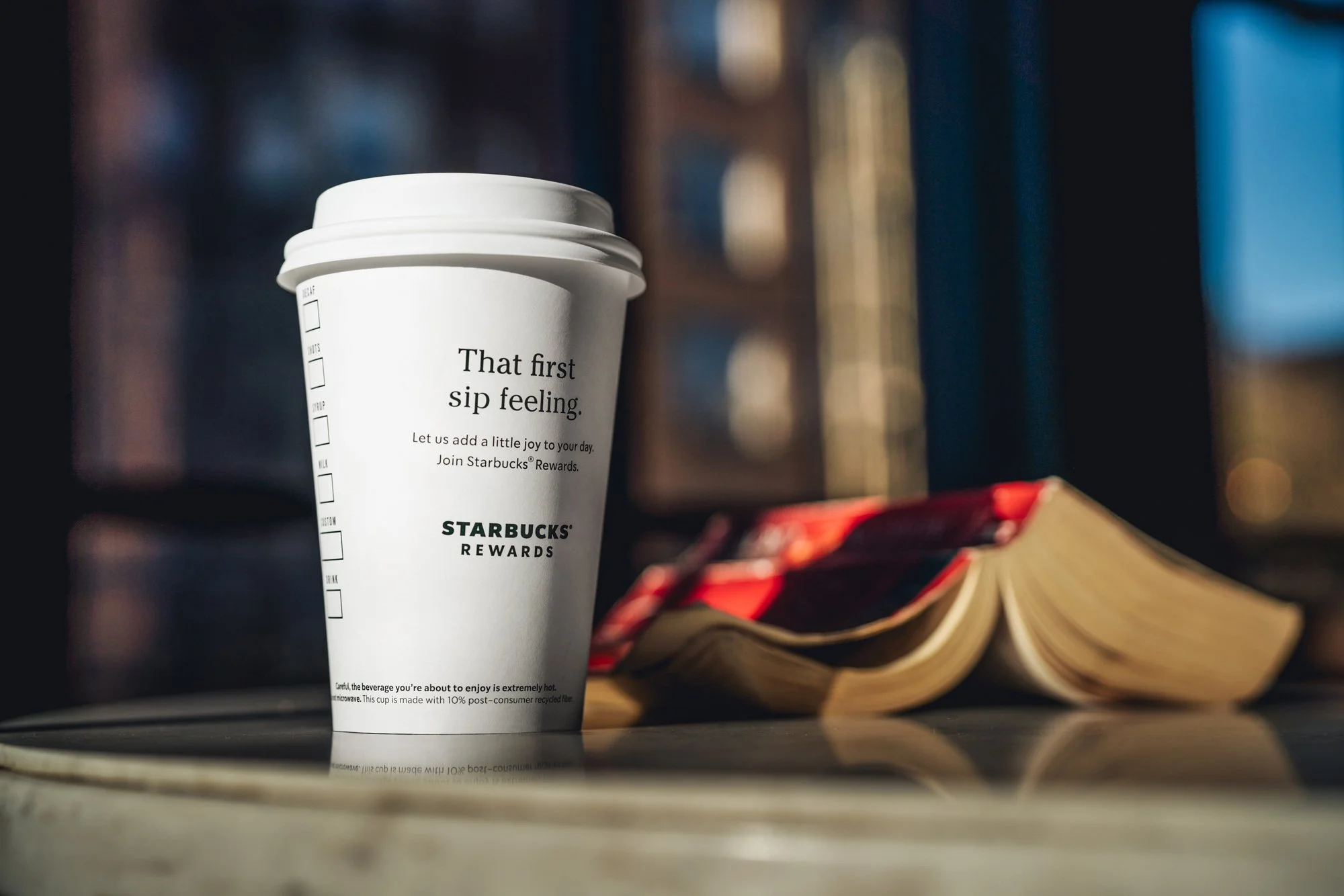
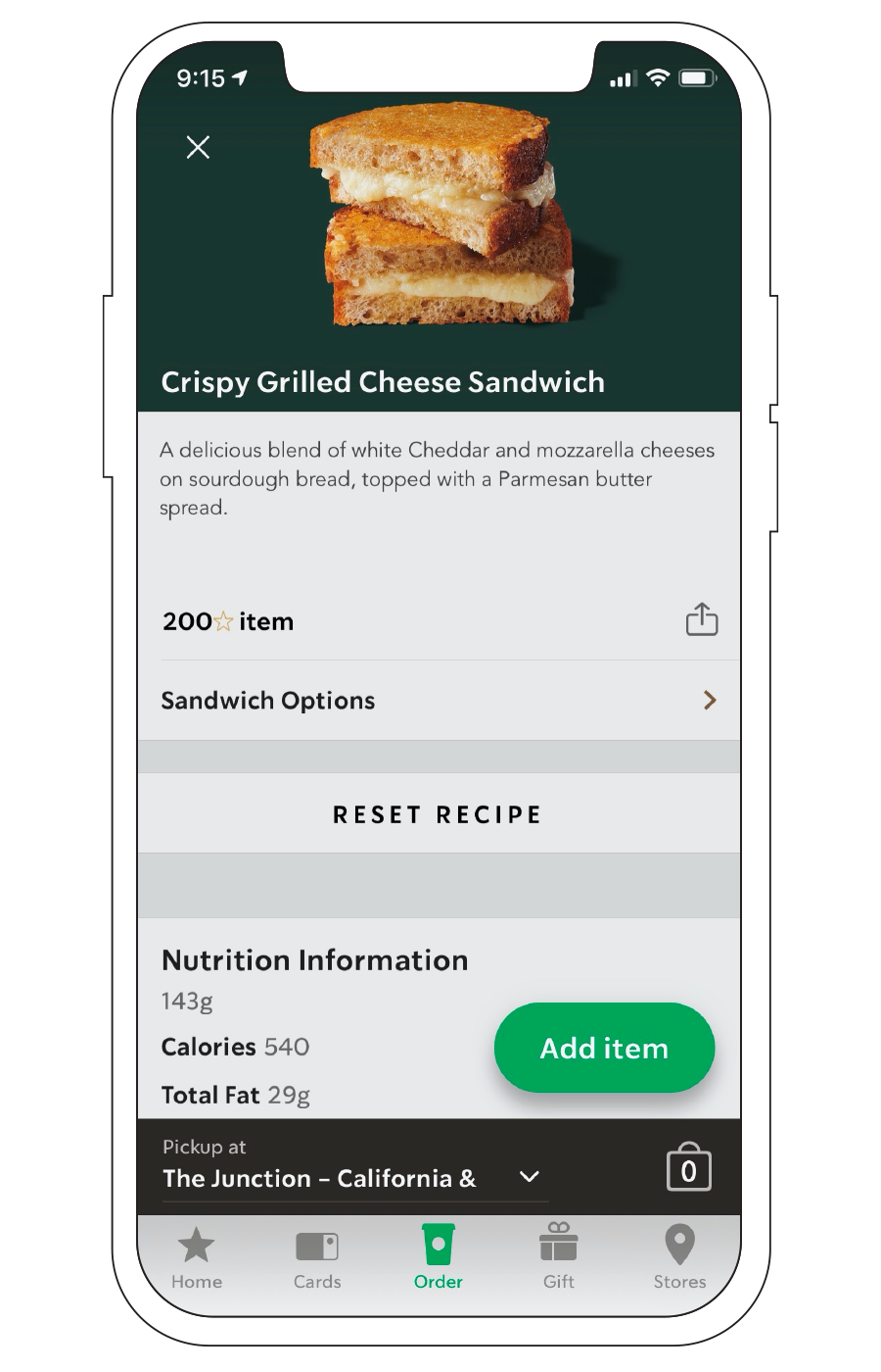
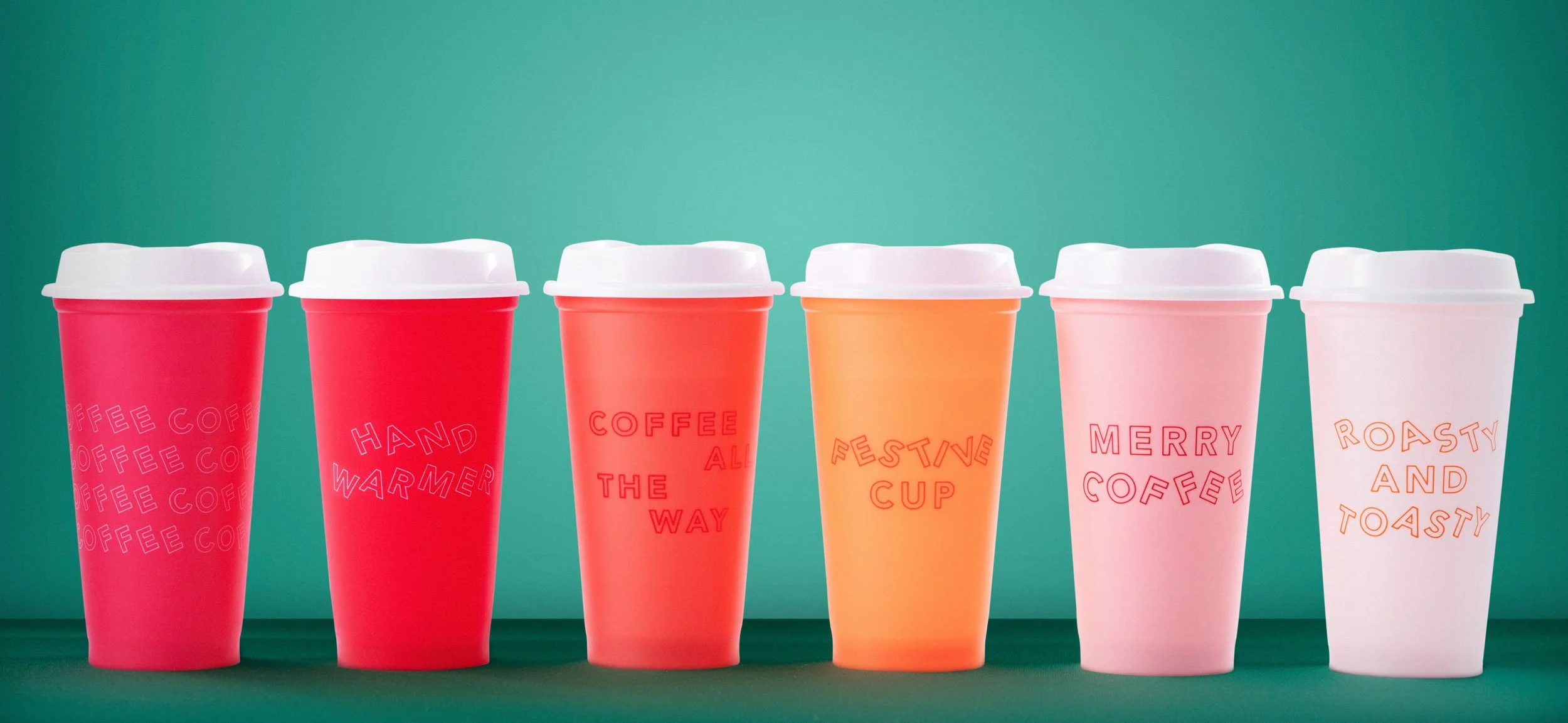
I championed the system internally, building alignment, secured funding, and leading implementation across the organization. From the Starbucks app to coffee packaging, SoDo became the foundational typeface across consumer touchpoints, even finding its way onto holiday cups.
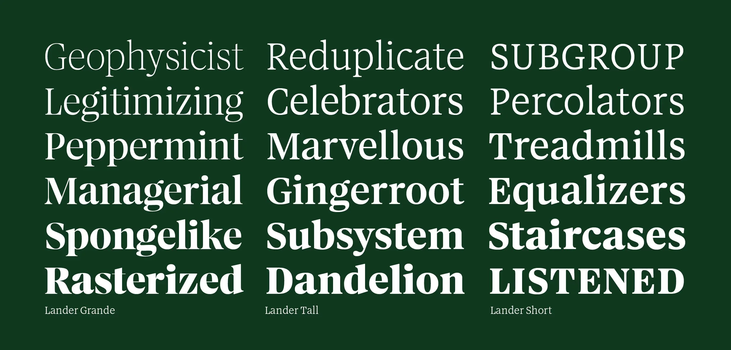
The success of SoDo led to a second chapter. We collaborated again to create Lander, a serif typeface born from a desire to replace Sentinel and reconnect the brand to its 1970s origins. Lander nods to the heritage of photo lettering while refining that tradition for a modern corporate environment.
What began as a personal aspiration became a defining professional milestone. Not just a type system, but a lasting expression of brand voice at global scale.


Credits.
My role
Creative Director
Agency
Riley Cran Type Designer