StarbucksStore.com
Starbucks Coffee Co.
StarbucksStore.com Starbucks Coffee Co.
Creative Director 2015–2017
Creative operations restructuring
Tens of thousands of $$ saved in photography costs
Creative quality increased
YouTube videos surpassed 5.3 million views
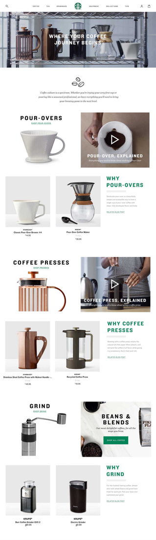
Identify opportunity and push boundaries.
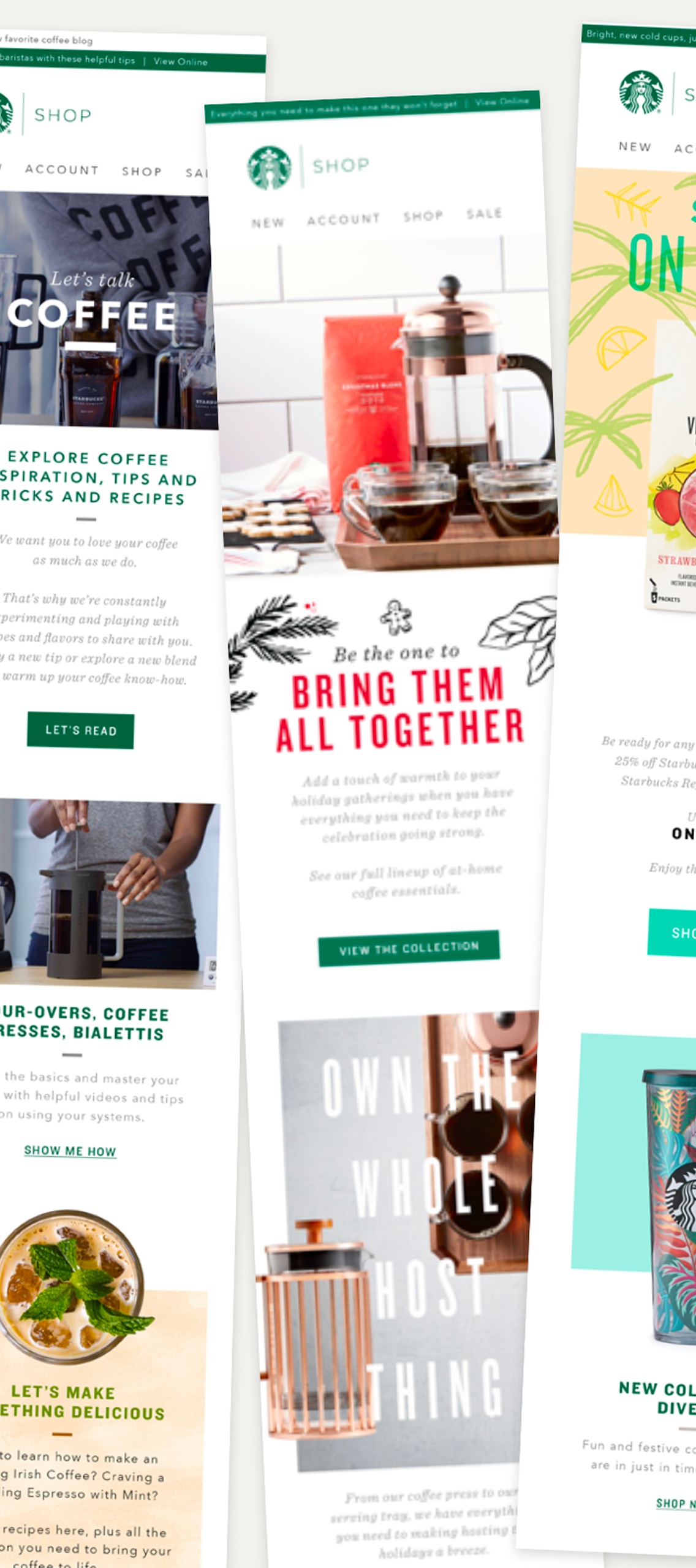
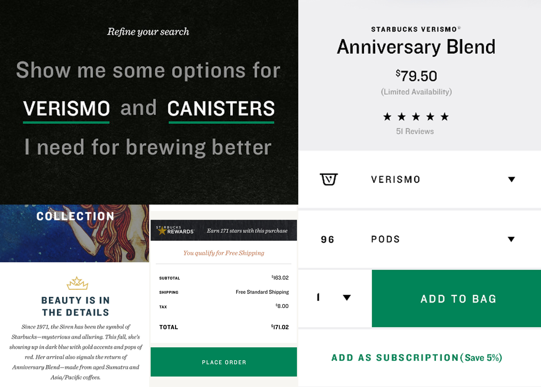
StarbucksStore.com was one of the weakest expressions of one of the world’s strongest brands. I was brought in to fix that.
StarbucksStore.com felt transactional, fragmented, and visually disconnected from the emotional equity customers experienced in-store and on Starbucks.com.
Navigation was complex. Mobile conversion lagged. Product photography lacked consistency. The experience did not reflect the trust and craft Starbucks had earned over decades.
The opportunity was clear: transform a functional commerce utility into a brand-aligned retail platform worthy of Starbucks.
-
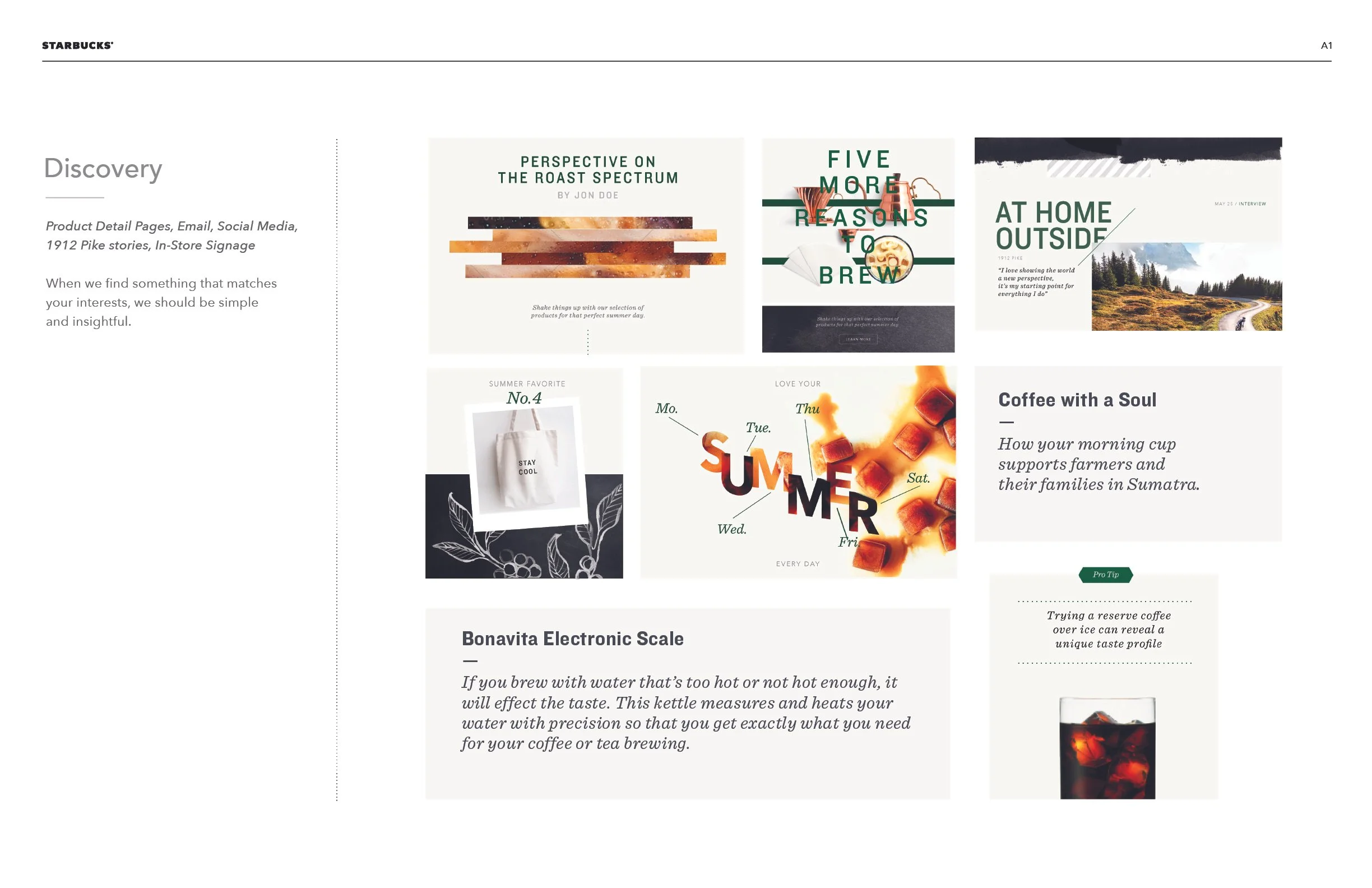
Craft each product detail page to reinforced the craft and provenance of the coffee. Elevate each piece of merchandise beyond technical specs and the price.
-
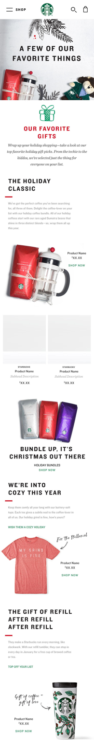
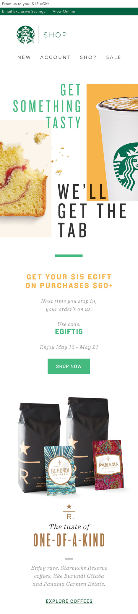
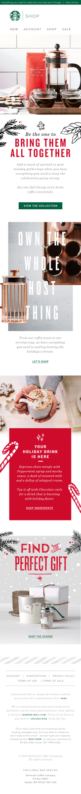
Design the homepage intentionally moving away from a cluttered promotional grid into a cohesive, modular storytelling system that elevates the brand.
-
I partnered with strategy to define a new creative foundation and led design in collaboration with our platform vendor to rebuild the experience from the ground up.
-
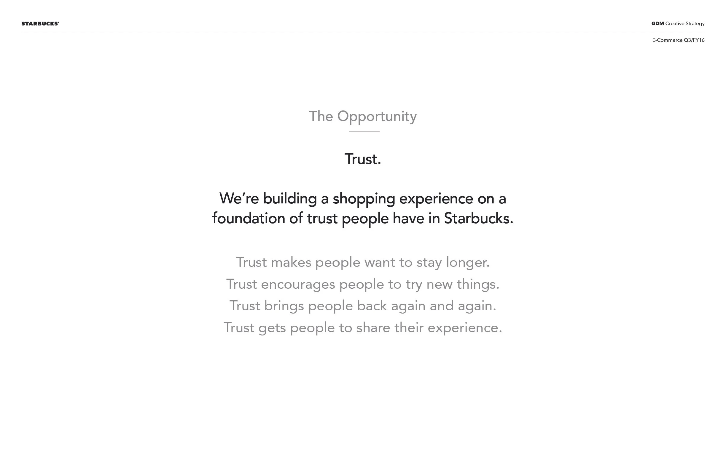
Build a shopping experience on a foundation of the trust people have in Starbucks. Trust encourages exploration. Trust drives trial. Trust builds loyalty and repeat behavior.
Define the job.
The marketing brief.
Convince existing Starbucks café customers
That StarbucksStore.com is the best place to buy coffee and coffee gear for home
Because it is the only e-commerce experience that delivers a curated selection from their trusted third place directly to their first place.
The creative brief.
Bring the third place home
We are building a bridge from café to kitchen. From ritual to routine. From third place to first place. When someone brews at home, it should not feel separate from Starbucks, it should feel connected.
That connection is the brand. This is not about designing beautiful screens. Across site, email, product launches, and storytelling, it is about building a cohesive creative experience.
Typography must hold voice. Color must hold emotion. Iconography must hold clarity. Motion must hold rhythm. Everything should feel unmistakably Starbucks, whether someone is browsing on mobile at midnight or opening a box at their doorstep.
Define the center.
If it feels like a catalog, we have failed.
It must feel like Starbucks: warm, confident, intentional, human. Every decision made—photography, typography, layout, motion, voice—must hold the same emotional equity as the café.
Define the feeling.
Lived In
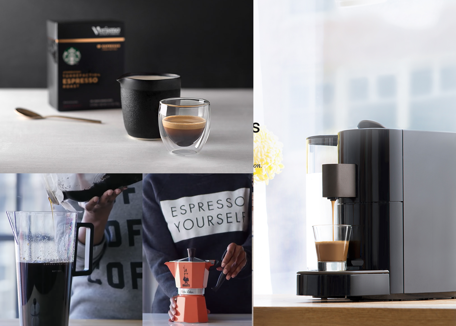
Photography should show daily ritual, not just a commodity and product.
Design should create calm, not noise.
Copy should feel like a recommendation, not a promotion.
Guide, Don’t Push
In-store, a barista asks questions. They don’t point at a shelf. The site should do the same.
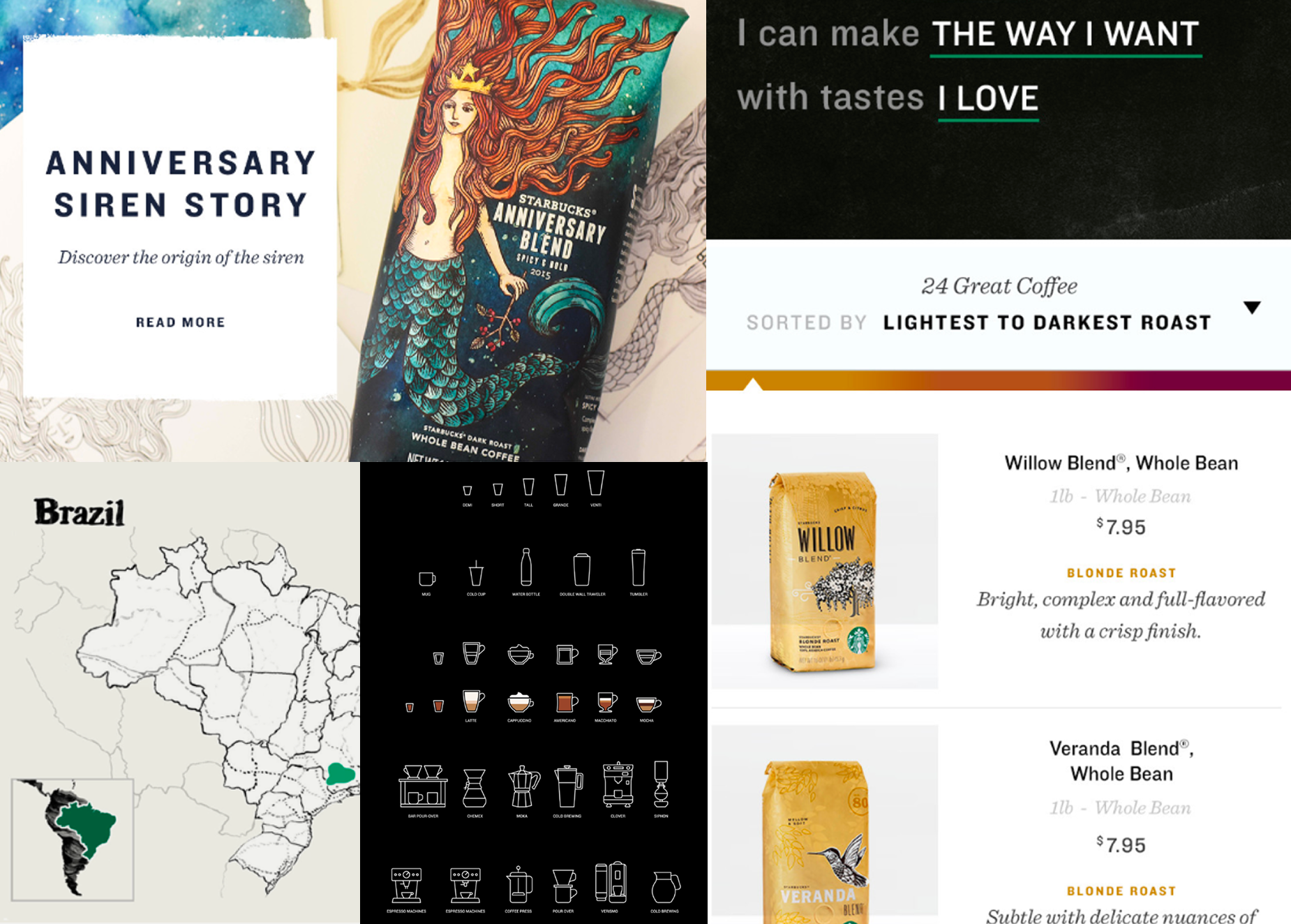
Roast spectrum should educate. Origin stories should invite curiosity. Brew guidance should empower confidence. Discovery should feel intelligent and effortless.
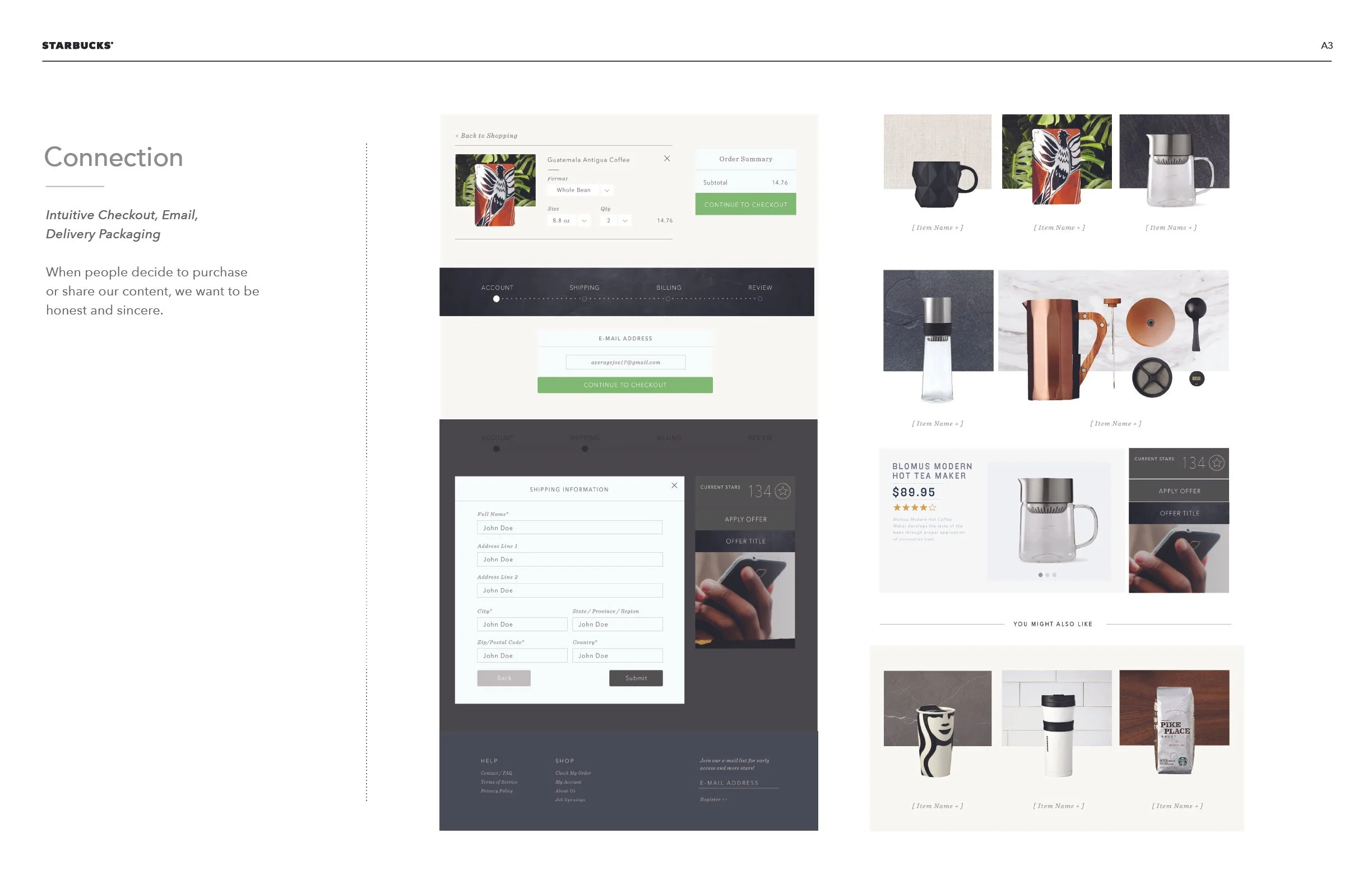
A Partner at Checkout
Checkout is not the end of the journey. It is a commitment. It should feel intuitive, reassuring, and respectful. No anxiety. No clutter. No confusion.
The brand cannot disappear at payment. When the package arrives, it should feel like it came from the same place that made their favorite drink.
Define the brand.
Through a strong, relationship model, I wanted to Create a Starbucks eCommerce brand that partners would be proud to stand behind, that pushed the boundaries of innovation, and that built a shopping experience that our customers will return to again and again.
-
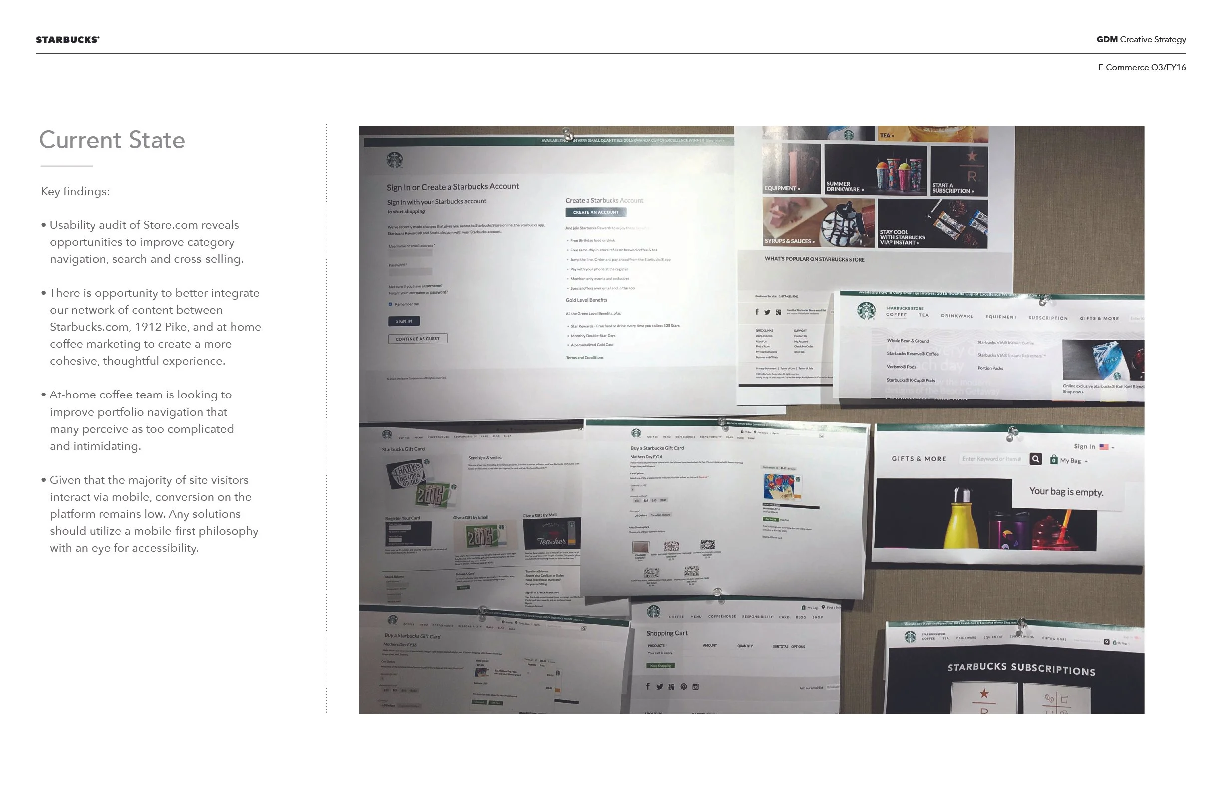
![Current State]()
Discovery
-
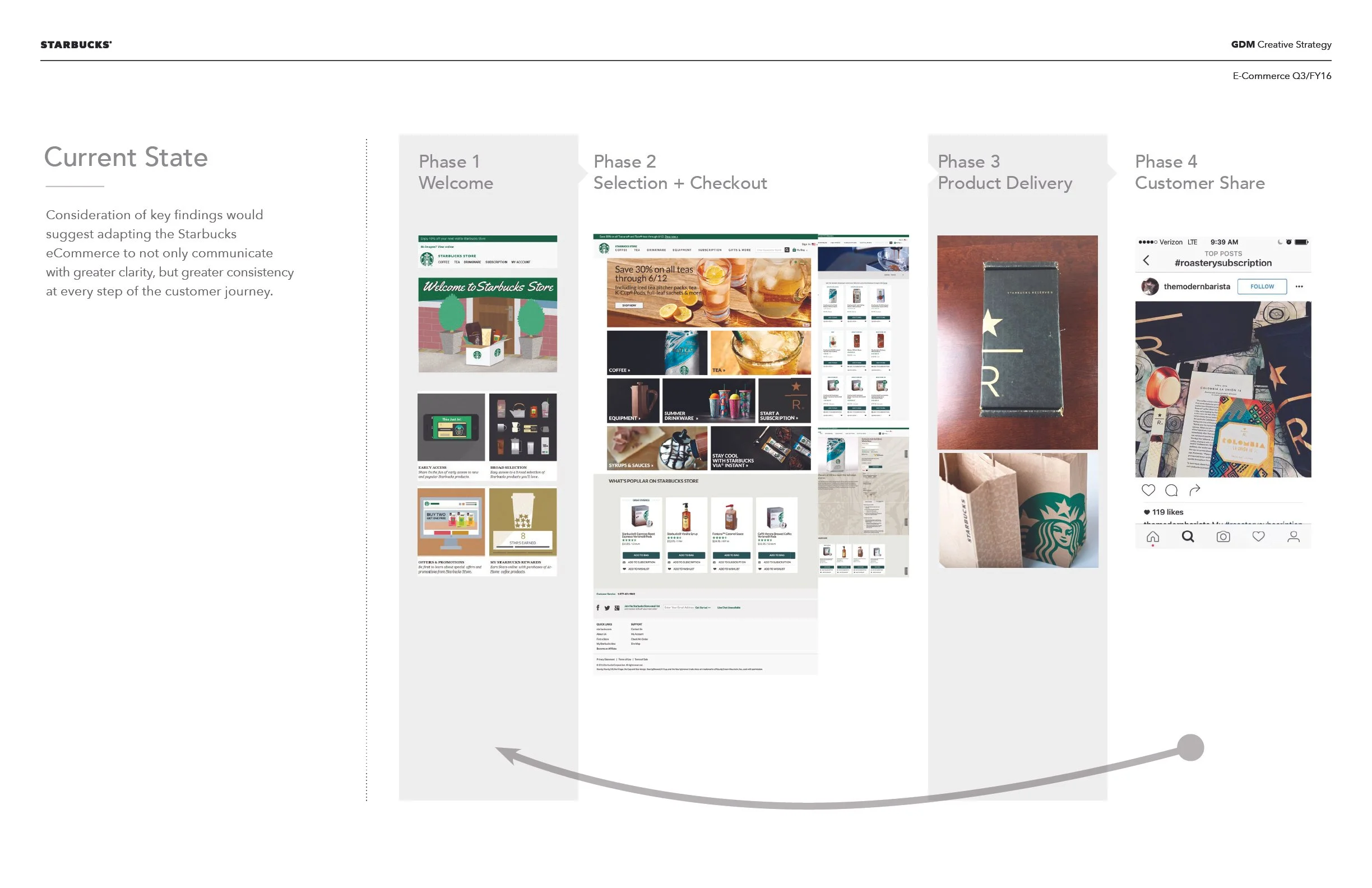
![Current State]()
Evolution
-
![Howard Schultz Quote]()
Founder Truth
-
![North Star - Trust]()
North Star
-
![Relationship model]()
Guiding Model
-
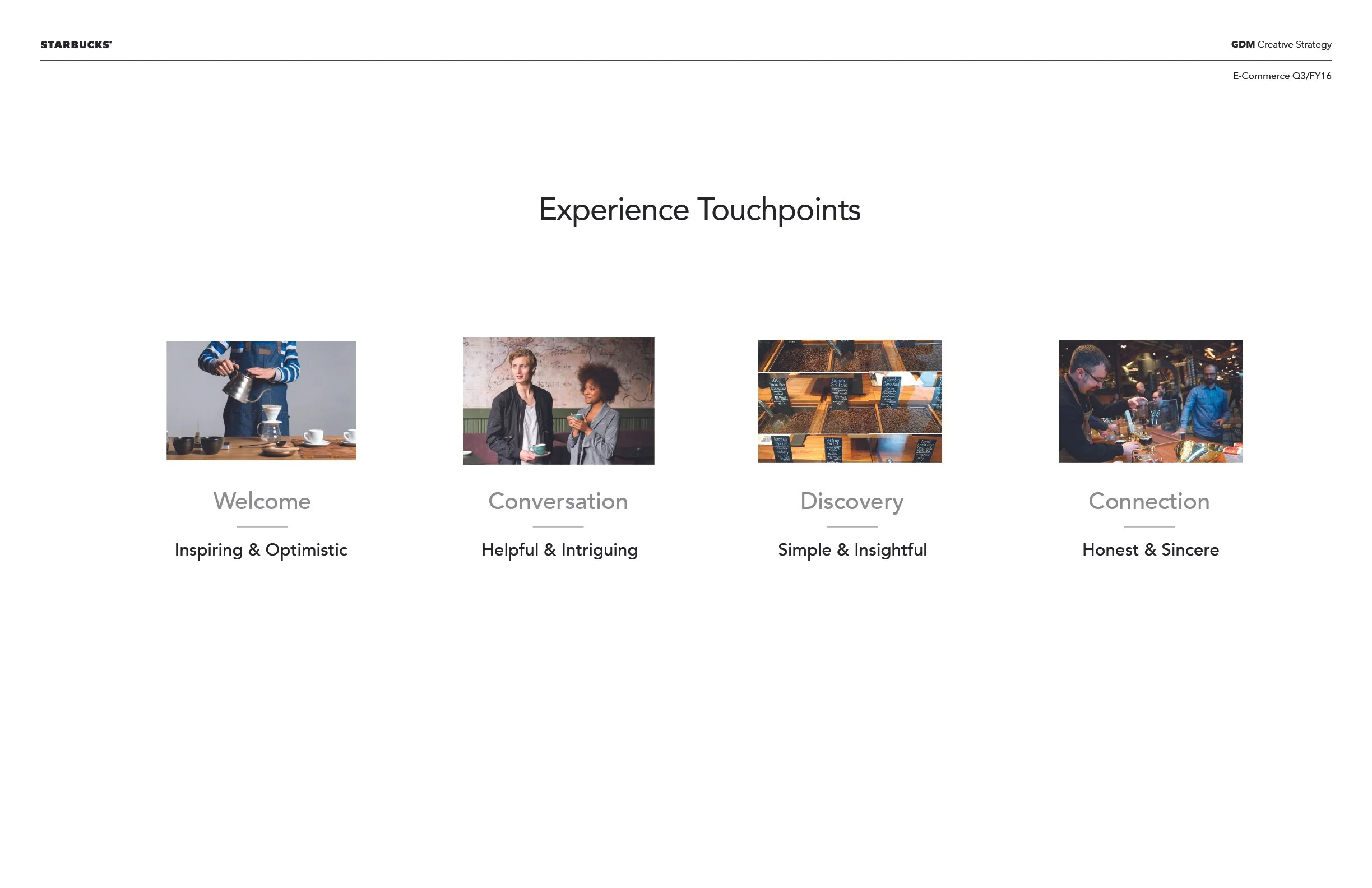
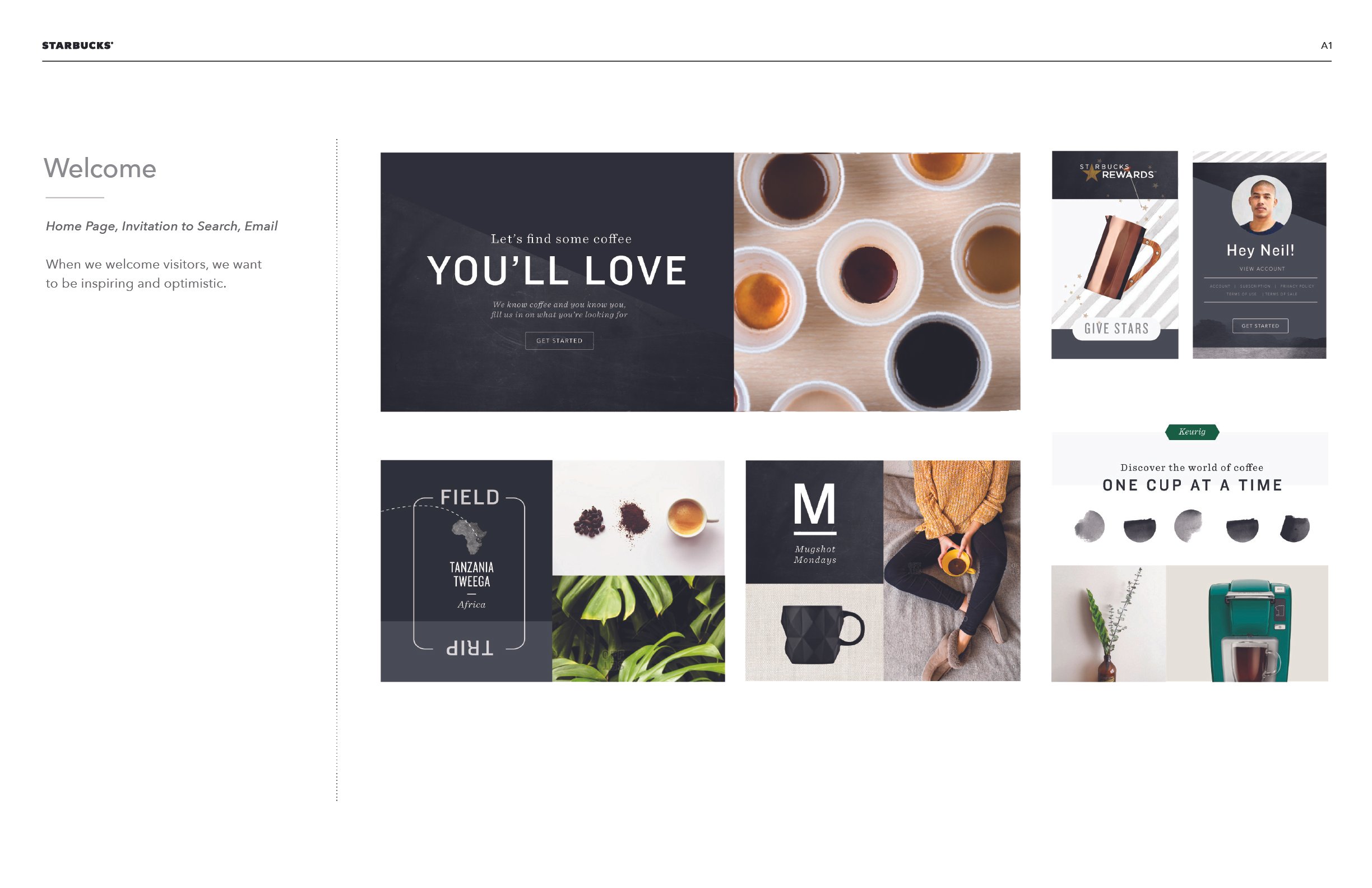
![Welcome]()
Welcome Them
-
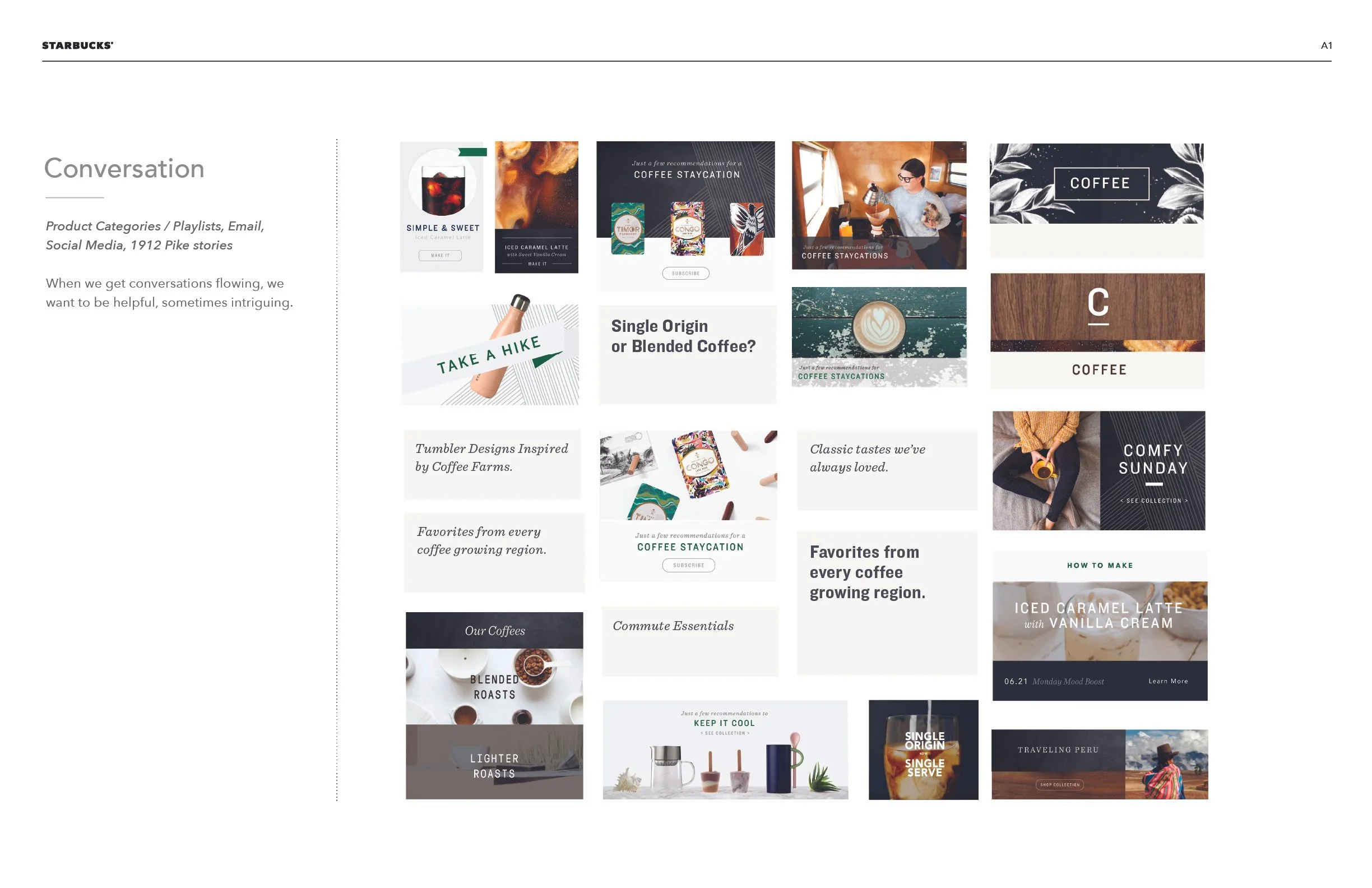
![Conversation]()
Have a Conversation
-
![Customer Curiosity]()
Allow for Curiosity
-
![Connection and Conversion]()
Connect to the Brand
Doing the work.
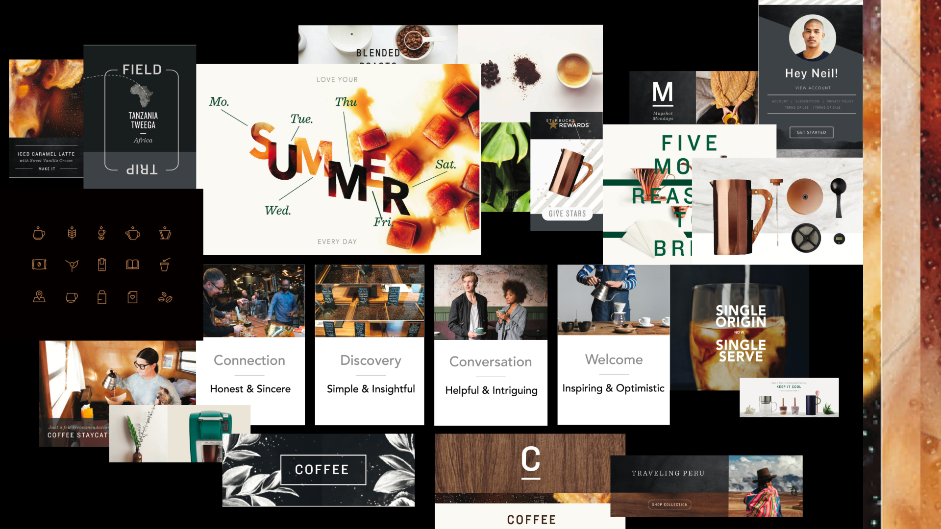
Over the course of a year, we transformed Starbucks eCommerce from a fragmented retail utility into a cohesive, brand-aligned platform.
This included launching a new site experience, defining a clear brand strategy, producing more than 200 site placements and 150+ emails, and establishing scalable photography and content standards while building brand systems to support long-term growth.
The work represents selected expressions from that broader system, designed to connect the first place and the third place with clarity, consistency, and craft.
In the end.
Bringing creative in-house to support an e-commerce business was a defining challenge. In a short time, I led a small team to transform store.starbucks.com from a parody of the brand into a disciplined, high-quality retail expression. We redesigned the site, optimized components, templated emails, defined the voice, reimagined photography, and rebuilt the briefing and resourcing model. Most importantly…
Customer-centric content
How-to-brew videos surpassed 5.3 million views on YouTube, extending brand authority beyond the transaction.
Cost savings
By building a scalable product photography system, we saved tens of thousands of dollars in vendor costs and hundreds of hours of art direction time.
Deliver and Deploy
In one year, the team delivered more than 10 net-new page designs, more than 150 emails, more than 200 marketing and promotional updates, and crafted nearly 1,000 product images and descriptions.
Credits.
The Team
Suzie Reecer
Art Director
Omar Cruiel
Lead Copywriter
Trevor Basset
Sr. Designer
Ellie Atchley Copywriter
Henry Jarman
Motion & Production
Cameron Searcy
Sr. Designer
Bill Quackenbush
Creative Program Manager
Aaron Bear
Producer
My role
Creative Director